Graphic Design Work
Illustrator is my friend.
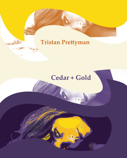
TPoster Contest Entry 2012
I liked her CD and there was a contest with a design for her winter poster that represented her new album. Here's my description for the entry: "I was inspired by the concept of turning troubles into gold. The album seems to hit these rough turns of deep emotion that made me envision deep purples and blues. But then there are songs that come up for air and hit the golden-side of life and I believe this album represents what God gave people gifts for. Art, music, dancing, writing... these outlets of talents let us open up and process in a way that can be shared and expressed to others in a way that ultimately leads us to become greater at handling life's challenges. I think truth -especially the deep hurtful kind that most people turn away from or hide from others- takes guts to express and even more bravery to put to lyric and record onto an album."
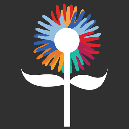
4Charity Logo 2013 http://4charity.weebly.com/
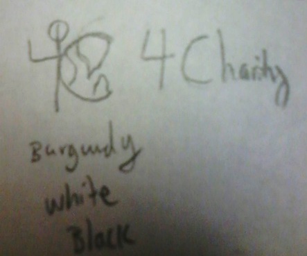
Initial Sketch/Concept
The 4Charity Banner 2013

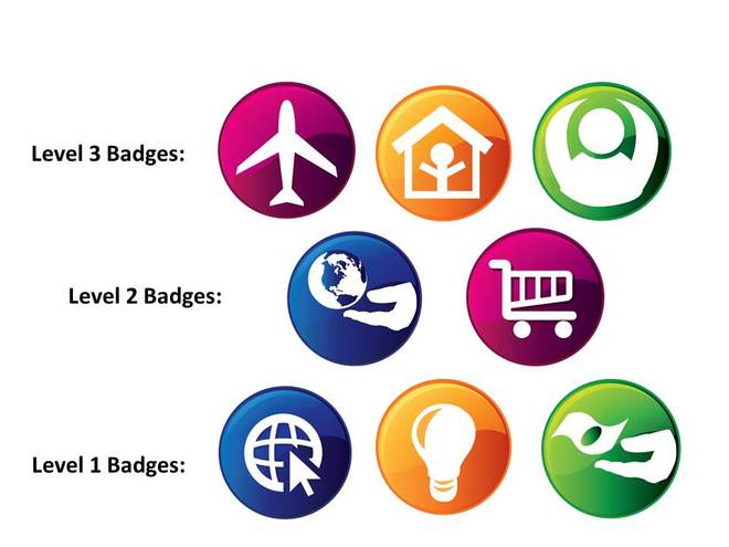
4Charity Badges
On top of creating 4Charity (which I created to help people figure out which charity to support based on different categories as well as the many different ways they can support a cause) I also felt compelled to encourage people to actively engage in the various activities most charities request from people. I therefore proceeded to create 8 badges of achievement a person could accumulate. The 1st Lower-Level Badges represent Participating Online for a charity (such as "liking" a cause on Facebook), Contributing Creatively (through art, writing, speaking, or some other means), and simply Donating Money. The 2nd Level of Contribution covers Shopping Online through a cause's store and Donating Tangible Items to a cause. The 3rd Level includes Traveling or Attending an Event for a cause, Joining or becoming a Member of a cause, and Participating In-Person for an activity that supports a cause.
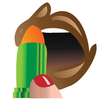
Animal Product Testing 2013
Helped a friend work on a project in Illustrator. She wanted to show a rabbit and something to do with lipstick to show how animals are abused and used as products to test products. I decided to use the "applied lipstick" and make it allude to an image of a rabbit and the "lipstick tube" to allude to the image of a carrot. It was a visual contradiction between the way things should be -rabbit and carrot in their natural states -and the way things are -animals being used inhumanely to test out beauty products.
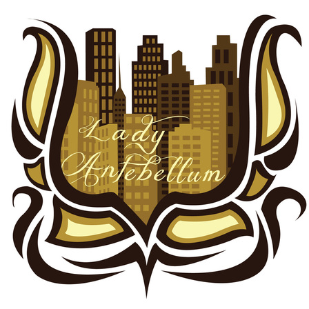
Lady Antebellum Contest Entry 2013
Lady Antebellum was hosting a T-Shirt design contest for graphic designers. Their guidelines were to create a design that could also be applied to Water bottles and other marketing material. Themes were: rustic, clean, folk-art, and unique. Their tour is called the "Take Me Downtown" tour and their latest album is called "Golden".
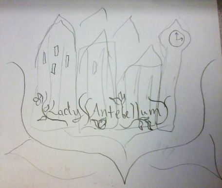
From Sketch to Final Design...
Graphic Nature Designs 2013-2014
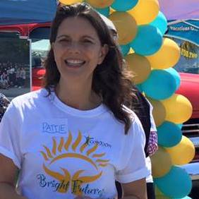
Mentoring Program for At-Risk Youth -Logo Iterations (2013)
UPDATE!!! They wanted me to officially design a logo for their NEW mentoring program called "Bright Futures". They gave me little to know direction or vision when it came to what the actual logo itself would be comprised of. I decided to go with the sun (BRIGHT) in the palms of someone's hands blooming (FUTURE). They then decided on the color scheme.
Pattie Cortese who has supported the group for many years then made t-shirts with the new logo.
More Teen Mentoring Logos -2017
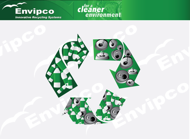
Recycling
I was asked to make this when I first started out in graphic design for a company that recycled.
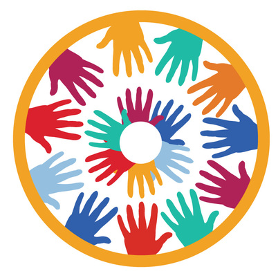
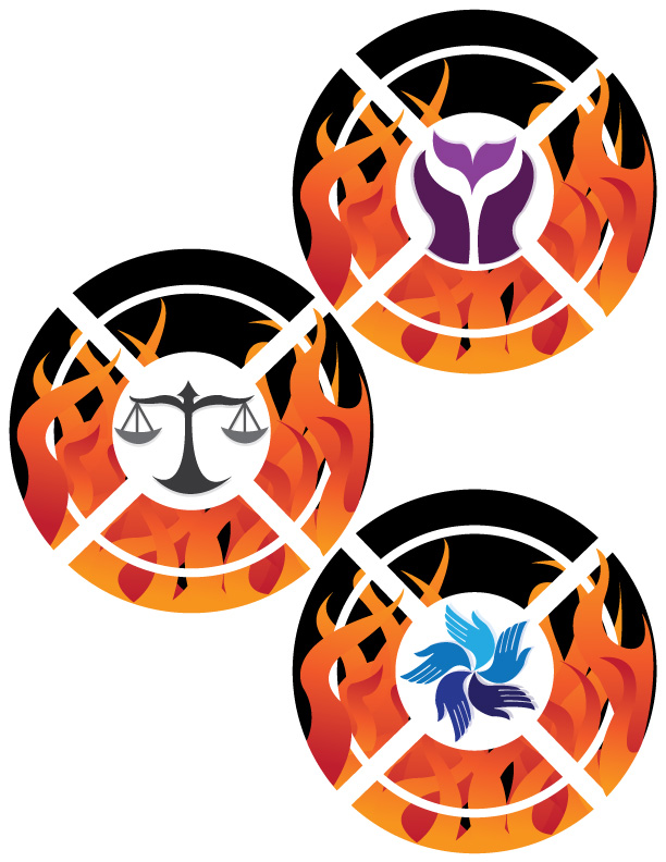
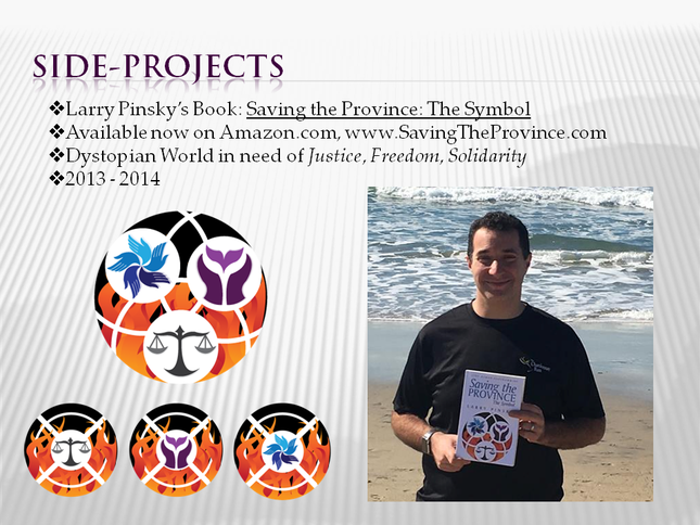
Commissioned Artwork: Circle Creed of Values
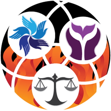
My friend actually bought a gift certificate from me paying for 3 images I would be commissioned to create based on the person's requests being gifted the certificate. The person ended up being my friend's father who is working on a teen-book themed around a distopian society that forces teens to enter into its military. One teen girl fights to resist the military government and uses the symbols I have been asked to create as a way to unite others to follow her. Initially I interpreted it as 3 separate symbols relating to the concepts of Justice, Unity, and Freedom. Then I was asked to compile the symbol into one. (Spring 2014)
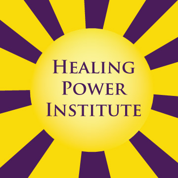
Healing Power Institute Logo -my friend's new therapy business
She wanted to have "healing" and "power" alluded to as well as the image of the sun which she felt represented power/energy/positivity. A couple different sun iterations were made and this was the one that worked best. (Summer 2014)
Then she changed her mind and decided to become a Romance/Relationship Therapist so I redesigned her logo. She wanted to incorporate a heart shape and keep the colors the same. She also changed the name. Initially she wanted to keep the colors purple and yellow, but after some feedback decided those colors didn't represent the message she wanted to convey well enough. These were the iterations I came up with...
Traveling Specialist Logo
My friend is a travel agent and wanted a logo that showed she could arrange cruise trips as well as land trips. She also wanted the black, white, and a very specific green color used. (Summer 2014)
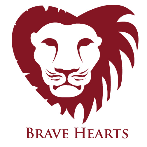
Brave Hearts -a small "tribe" of women speakers. (Summer 2014)
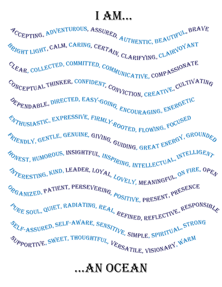
"I Am..." (Summer 2014)
From the Brave Hearts group, these are qualities that they said they saw in me when I was speaking in front of them. Over the course of a month the words were written down each week on a heart-shaped card. I then compiled the list. The words in light blue are words they said I possessed. The words in dark blue are either other things I see in myself or qualities I seek to embody.
Love's Story -Infographic
I found this story and was inspired by it so I created an infographic for it. (Summer 2014)

